
Line
The line is geometric with organic added in edges, with a softly curve font.
Balance
The balance is good with the perfect rectangle that has color offsetting balance to the right, offset by the heavier name lettering on the upper left, similarly the smaller lighter lettering of the portfolio links in the upper right and the years in the bottom right are balanced by the site links in the bottom left. The image to window stays balanced and center no matter how the window is expanded.
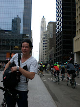
Contrast
The white lettering is in contrast to the grey background. The stroke on the name Ben Hulse is thicker than the rest of the lettering. Even the word “design” that is in the title causes contrast, and therefore the name to stick. In the right of the picture itself, the color is in stark contrast to the grayscale in the rest of the image, as is the man’s legs in the picture’s left. The man’s shoes are in contrast to the image even though they are in the same color scale. The shoes are contrasted by the starkness of the pure black that is found almost nowhere else on the image, and the tightness of the checks even though it is echoed throughout the rest of the image with the tiles.
Shape
The images prevalent shape is a rectangle. The outer rectangle is echoed with the rectangular shapes in the image, and the tiles in the image.
Information
The site clearly but in a subdued way states that this is a designer that des: print, web, photography, makes apparel, and video.
Hierarchy
Since the designer’s name has the larges and boldest font, it is clear what he wants to convey the most. The striking image speaks passively about his work. Smaller are the links to hip types of work, allowing you to select and find out more after the image itself has sold you on it.
Harmony/Unity
The colors all work perfectly in sync with each other. The clean and clear fonts compliment the Spartan page and contrast well with the picture’s geometry. The subdued lettering that makes little pretension pairs perfectly with the clean text-less image as if everything should speak for itself. Everything fits with the page.
http://www.benhulse.com/
No comments:
Post a Comment